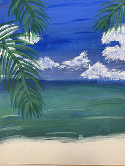
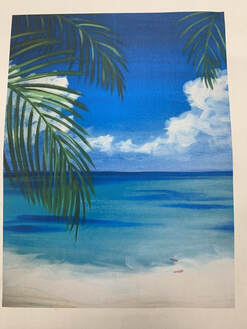
DESCRIPTION: My piece is suppose to represent a painting of a tropical beach. The ocean has a greenish, tinted turquoise that is a usual color for most tropical oceans, and at the bottom you can see the waves crashing at the shore. In the background, it's just a basic ombre color of blue with clouds over it and hovering above the ocean. On the sides there are green palm trees hanging around but isn't fully visible.
ANALYZE: The color scheme for my painting are mostly different colors of ombre. The sky starts at a darker blue and the lower you go, the more lighter the blue will get and blending it thoroughly to get a realistic look. Also the ocean has a ombre of colors with a greenish, turquoise look, it also has different variations of color in the ocean to make it look realistic. - The balance in my painting is a great combination and evens out everything so nothing stands out. All the lines, shapes, colors, etc., relate to each other within the composition in terms of their visual weight to create visual equilibrium, so it doesn't seem like one side is heavier than the other. INTERPRET: This painting really inspired me since I love going to the beach and my family and I always go every summer. The beach is a very loved place of mine so it's meaningful to me it's like a second home, so i got inspired to draw this since it always reminds me of home. The view is a beautiful sight to see so my painting represents what I see when I go to the beach. JUDGE: For my piece I think one of the most successful things about it is the blending of the sky and ocean, it seems realistic to me and I am very proud of it since I worked hard to make it the way it is. I learned a lot of things from this assignment but one of the most important things I learned is patience. This piece took quite a while and at timed it would be very stressful either because I kept messing up or it just looked too simple. Patience is important to learn because you won't get as frustrated over a little, simple mistake because you can just learn from it and recover from it.
0 Comments
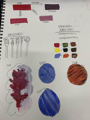
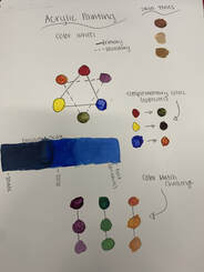
These warms up helped me learn many things. I've learned the techniques of shading and texturing things to make it seem like its a 3D object, also creating new colors. One of the most helpful warms ups was the circular drawing because it taught me how to blend easily and make them all mix together nicely and efficiently. In my painting, I needed to paint a sky and that warm up helped me with blending the sky together so it seems like it is more realistic. The most helpful one that i learned alot from was the color wheel because it showed me the different colors you can make with certain colors that you wouldn't have expected. Some ways to make the color brown is by mixing together 2 complementary colors together, they can make different shades of brown but all are very sufficient. To tone down a color, it is very simple, just add some white into the color until your desired color, the white will tone it down making it lighter.
PEN DRAWING: 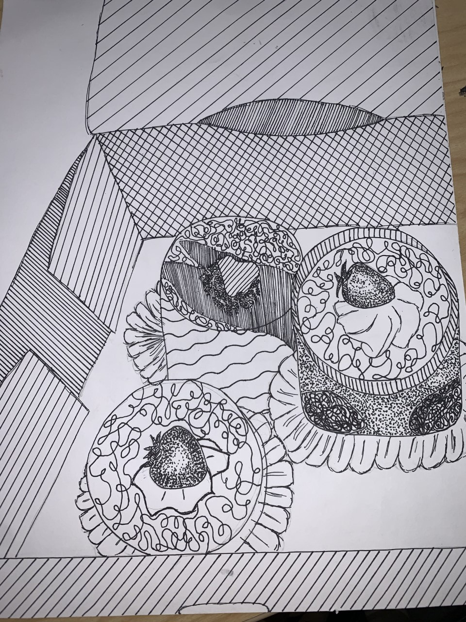 PROS & CONS: pros: - very fun and satisfying to make all the lines and squiggles. - can tell the difference between brightness and contrast. cons: - takes time and patience. - could mess up very easily with pen. PENCIL DRAWING:  PROS & CONS: pros: - if you mess up, you could easily fix it by erasing it. - you can make it more detailed. cons: - won't fill in as much room. - harder to shade in. CHARCOAL DRAWING:  PROS & CONS: pros: - very easy to rub the charcoal to blend in with your finger. - the contrast between all the colors are noticeable. cons: - gets messy easily - can easily rub off by your hand. FAVORITE WARM UP: 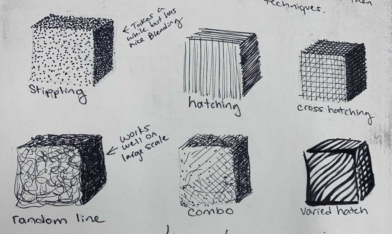 This warm up helped me a lot because of the contrast and brightness of all the lines crossing each other and how it can show the brightness of an image so it can also give it an abstrative look and more professional look. This is very entertaining to draw and soothing and it could calm you down if you are focused. COMPOSITION: the nature of something's ingredients or constituents; the way in which a whole or mixture is made up. A work of music, literature, or art.
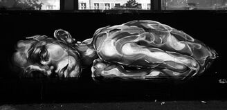
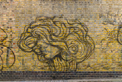
VALUE: the relative lightness or darkness of a color. Paola Delfin - She was born in Ciudad de México. She is best known as a visual artist, as well as a Muralist. Being influenced by illustrations and a mixture of unusual materials, she is as good with a spray can as she is with a brush or a pencil. When it comes to her favorite topic, exploring the feminine sensibility and beauty her artwork simply stands out. Growing up she would just draw out whatever came to her mind with a pencil and a piece of paper but she felt that wasn't enough for others to understand so she started making bigger pieces, like ones on buildings that the whole city could see and understand. She wants the whole world to notice her message and take it in.
Their artwork is very meaningful and unique and the thing that stood out most to me was how huge the illustrations would be and how much time and effort it would take. Her work inspires young children and mostly women because most of her artwork shows a feminine side and the beauty with all the colors and abstract shapes combine very well together and to see this artwork on a building in the middle of a city would be such a beautiful site. |